Eagle Creek Brewing
More than a few of us at Red Clay are more than partial to a good craft beer — our state has become a hotbed for innovative new breweries. When the opportunity came, it only made sense to tap into our creativity with Eagle Creek Brewing.
The Challenge
The craft beer market is visually saturated. Shelves of every growler shop in America are filled with artfully designed packaging. Being relatively new to the craft beer scene, Eagle Creek needed their logo and packaging to stand out in a busy beer cooler. We decided to let the beer speak for itself and make Eagle Creek Brewing stand out with boldness and simplicity.
The Logo
The Eagle Creek logo we crafted raises a glass to the brewery’s southern heritage. The clean, simple typography and color perfectly fit the aesthetic of their new packaging and brand.
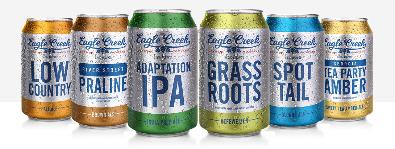
Can Designs
Eagle Creek has a palate-pleasing lineup of six year-round beers. Our team set out to create a clean, recognizable can design to give each beer a voice worthy of its full-bodied flavor. The ocean buoy inspired designs were a hat tip to Eagle Creek’s coastal heritage. Adaptation IPA, Spot Tail Blonde Ale, Tea Party Amber, Grass Roots Hefe, Low Country Pale Ale, and River Street Praline each got their own unique story and identity. We maintained a consistent aesthetic across the cans — letting the hop-forward copy make each beer’s voice as unique as its flavor profile.
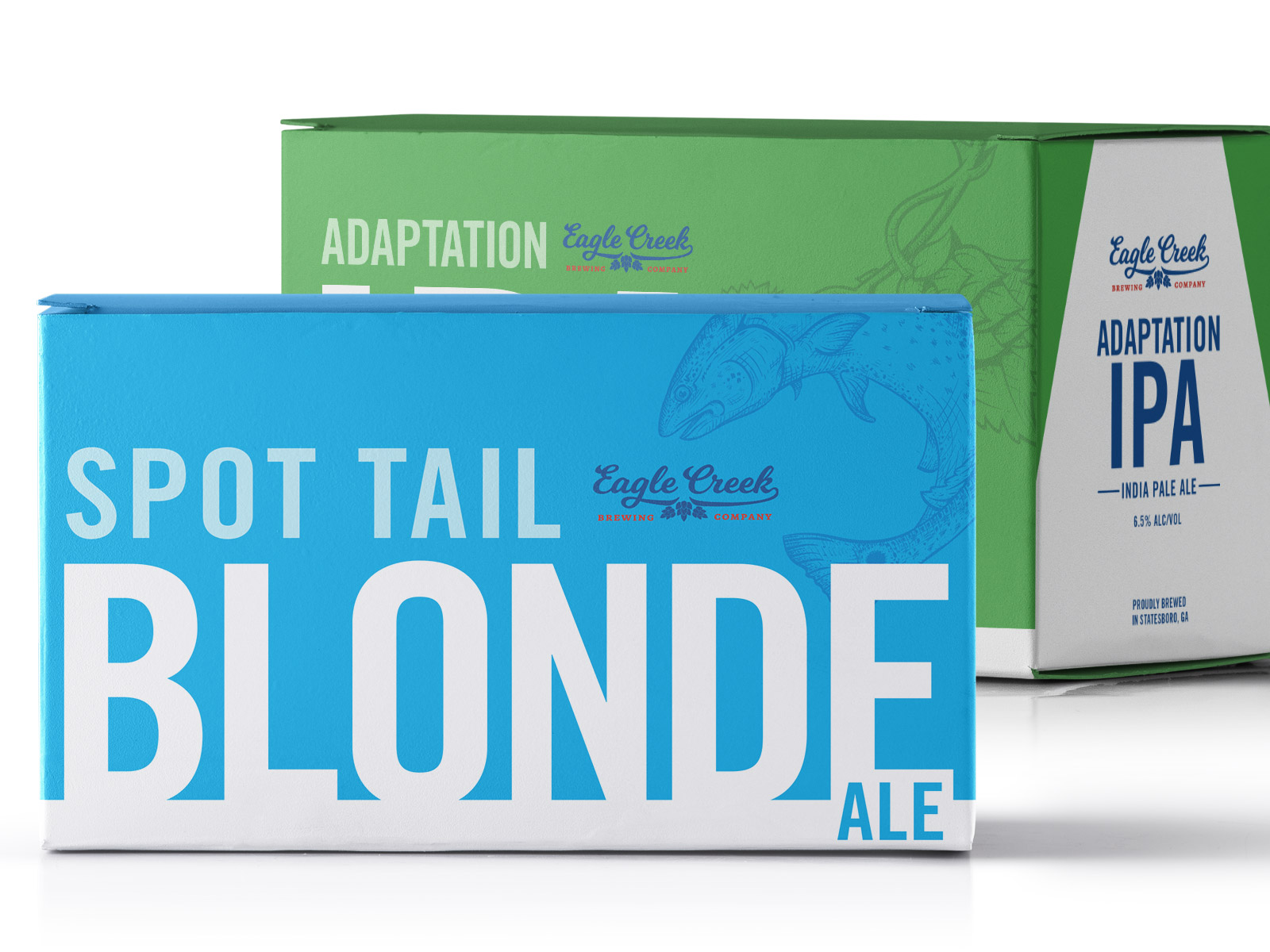
6-Pack Box Designs
The box design complements the cans with more playful copy and clean lines. Each box has subtle hat-tips to the ingredients and story behind the beer inside. We placed copy on the inside flaps of each box to give them an extra pinch of southern charm. “Nice place. Mind if we unpack?”