Could the menu button actually hurt usability?
2 weeks after launching one of our coolest responsive websites we couldn’t resist getting under the hood to see if we could tweak out a bit of extra performance. A conversation with our client tipped us off to the fact that we may have an unexpectedly large number of desktop users at 1024 x 768 screen resolution.

We took a critical look at our users screen resolution and device to determine the best course of action for the responsive navigation test.
The first iteration of this site presented those users with a menu button instead of a standard horizontal menu button. We decided that with so many desktop users at that resolution we would test to see if a more traditional desktop navigation would be better for users than the responsive menu button.
Establishing the test
The first thing we needed to do was define what measurements would determine the outcome of the test. For this site it would be engagement defined as an increase in pages per visit, increased average visit duration, and a decrease in bounce rate. In that order. In order to measure these things accurately we also had to separate out the user group that this site has which only comes to the site to log-in to their account. This group would skew the metrics and make it more difficult to determine a clear winner. A few custom segments were developed and our baseline was set. Now for the test.
Testing Methodology
Our team got together to define the actual test based on the situation. The methodology for this one ended up being very straight forward. Our developers would simply edit the 1040 responsive breakpoint to display the horizontal menu and save the menu button for the 960 breakpoint. We felt confident that this would display the traditional menu for all of our desktop users and save the hamburger for tablets and phones only. We would make the change, wait a week and then determine a winner.
Results
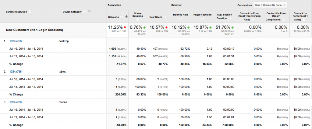
We didn’t even have to wait a week and we have seen a dramatic and positive impact on the desktop users in question. Bounce Rate and Pages/Session and Avg Session duration have all improved.

In this case the ubiquitous menu button had a demonstrable negative effect on the navigation menu. This test also supports the need to consider users for all design decisions and resist any sort of inertia that could sneak into design. Responsive design best practices are great starting points however they don’t take the place of good old fashioned testing and truly getting to know your users and their technology.

