Lately we have heard a lot of concern from companies about ensuring that web design is “above the fold.” This myth of designing “above the fold” was started with newspapers because they knew the biggest story splashed across the top got the most attention. Well, this is a new era of digital design and scrolling is not a fear web users have. In fact, with the mass increase of tablet owners and mobile use, scrolling comes naturally.
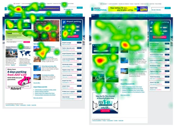
Cxpartners did a study with heat maps watching over 800 web users. They have disproved the theory of “above the fold” by first noticing the scrollbar to be a strong hotspot. Users expected to scroll.
Next cxpartners discovered that less content above the fold called for more attention below the fold allowing for users to become more engaged with valuable content. When a web design crammed everything above the fold, users did not scroll and became less encouraged to interact with the rest of the site. This evidence proved less is more and a use of imagery and white space is encouraged. Your business has a story to tell, you can do so with even spacing and enticing content. This will not be as successful by cramming it all in one spot and overwhelming your web user.
Paddy Donnelly makes a point by stating that, “if everything of exceptional quality is pushed upon the reader at the beginning, once they start exploring and the rest of the site isn’t of the same caliber, they’re going to be let down.” If you layout a site that tells a quality story and entices your user, scrolling is inevitable. Also, with responsive design being in high demand due to a lot of tablet and smartphone users, designing a web page with less clutter and more mobile compatibility is ideal for your web visitors.
Moral of the story: your web users do not fear the scroll, neither should you.